

Health & FitnessEcommerce
- UI/UX Design
- 3D & Motion Design
- Design System
- Ecommerce Strategy
- Shopify Plus Development
- Analytics & Testing
Platform: Shopify Plus · Online Store 2.0 · Liquid · GitHub · GA4 · VWO
Tonal is the all-in-one home gym on your wall, with up to 250 lb of digital weight, expert coaching, and a program that adapts as you get stronger. Now the company is bringing strength to far more people, with new ways to own a Tonal and a focus on staying strong for life.
The website sits at the center of that plan. It’s where people get to know Tonal, find answers to their questions, and decide to bring it home. Tonal made it the company’s top priority, and together we’re redesigning and rebuilding the entire digital experience on Shopify Plus.
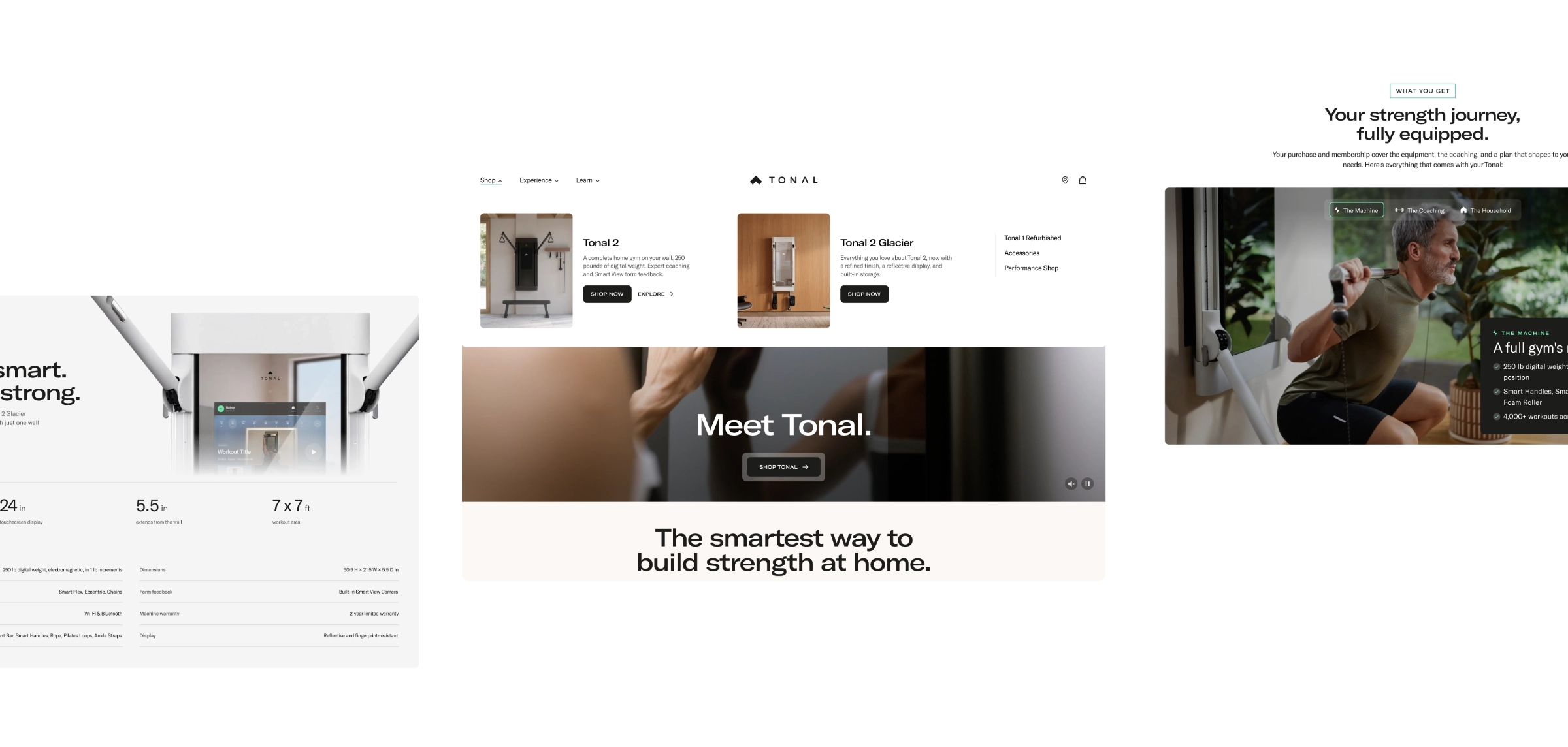
The new tonal.com leads with real members and puts the machine in motion, with a 3D model that responds as you scroll. Phase one went live November 2, the same day Tonal introduced Tonal 2 Glacier, and we’re already at work together on what comes next.

The Challenge
A big decision that starts on a phone.
Tonal asks people to rethink what a home gym looks like. Shoppers come back several times before they buy, with real questions about price, space, and whether it will work for them. Some are new to strength training altogether. The goal was a site as considered as the machine itself, built for where Tonal is headed.
Tonal’s team walked us through the machine, shared their customer research, and worked alongside us every week. Before launch, they tested our prototypes with real shoppers, and we refined the copy and imagery from what they heard.
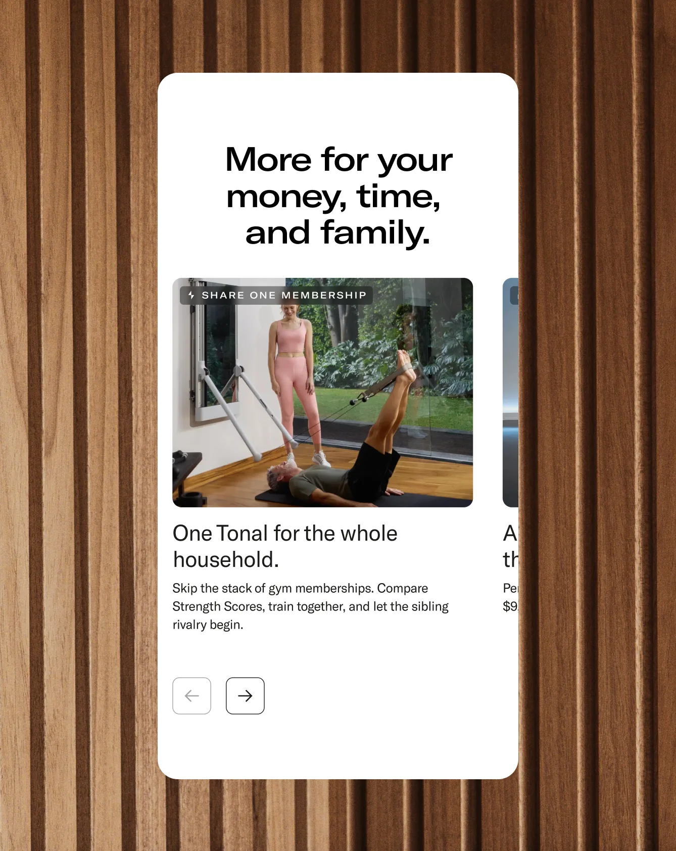
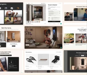
Homepage
Strength for every chapter.
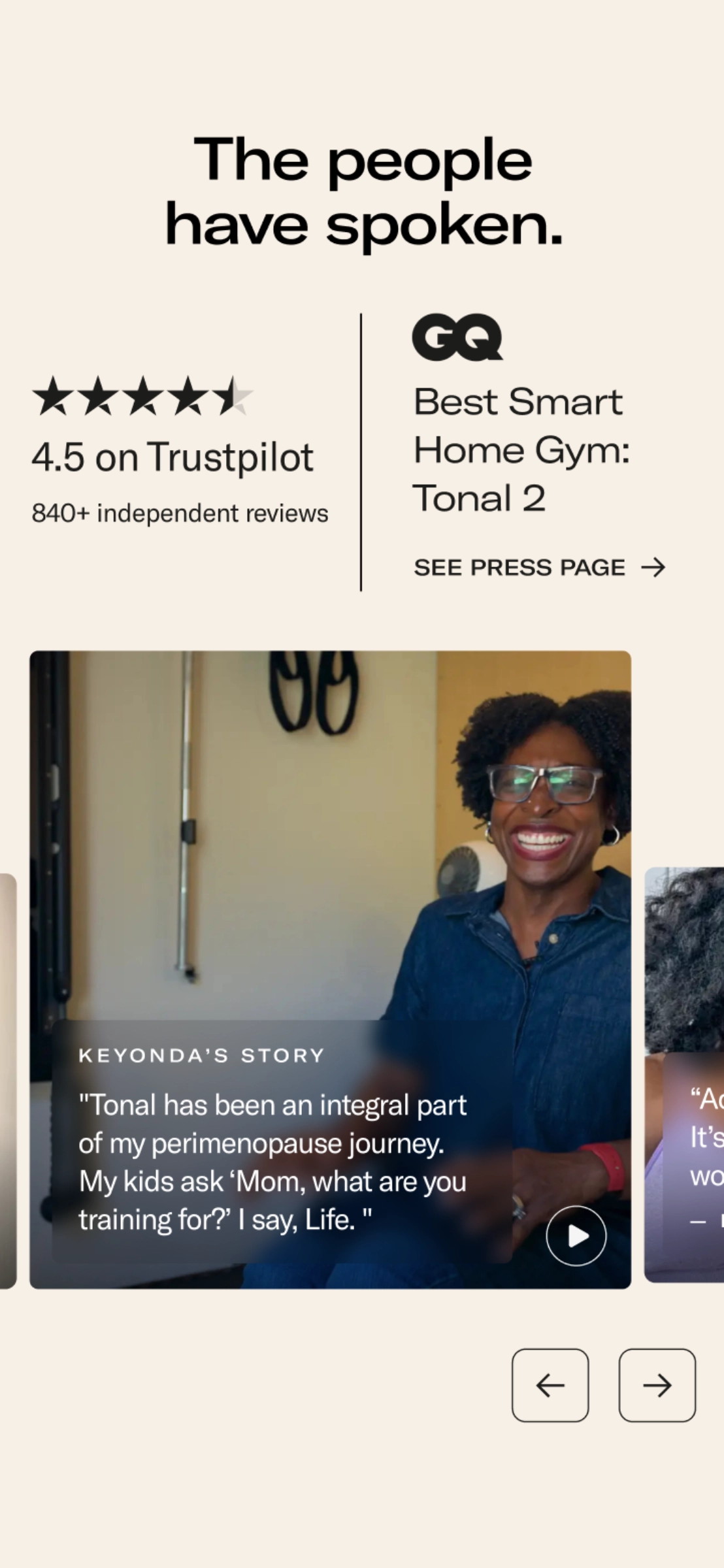
We built the homepage around Tonal’s belief that strength is for everyone, at every stage of life. Member stories and warm photography set the tone before a single spec appears.
From there, the page walks visitors through how Tonal works, from the first strength assessment to expert-led programs, with clear paths to shop or learn more at every turn.

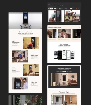
Product Pages
One wall. A whole gym behind it.
The product page does the heavy lifting. We organized it around the questions shoppers ask most: what’s included, how it fits in their space, what it costs over time, and what members think.
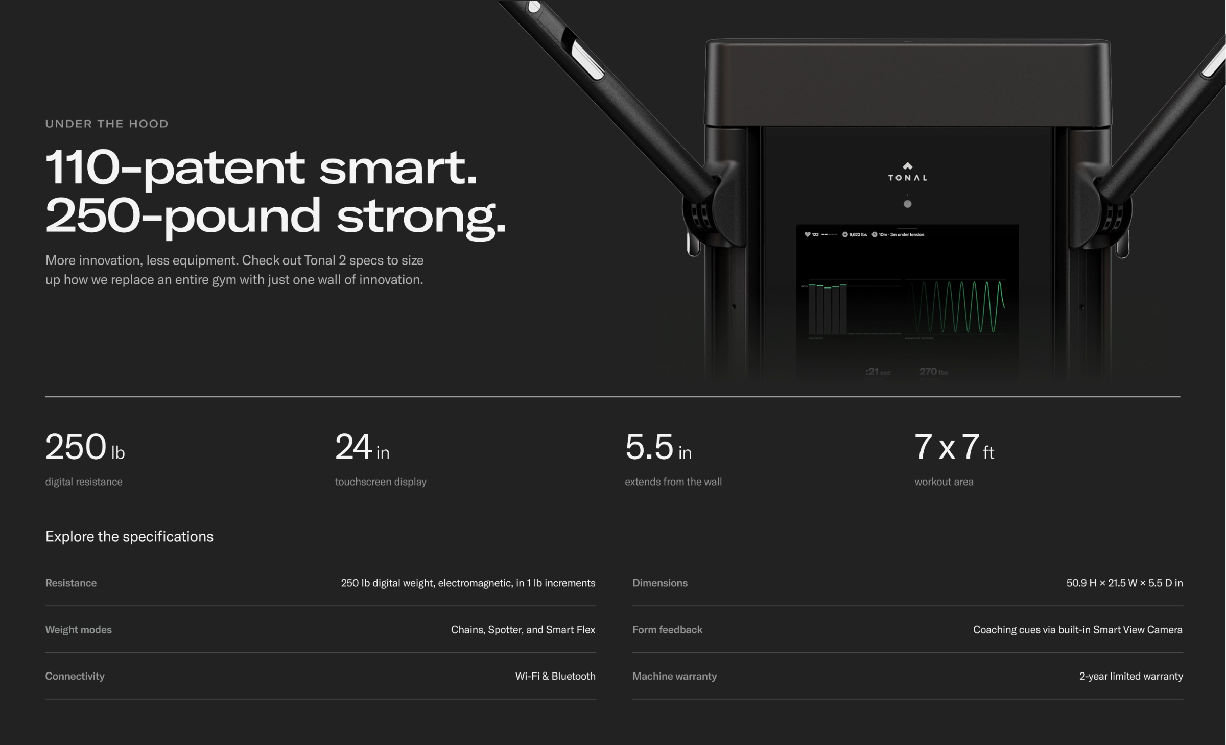
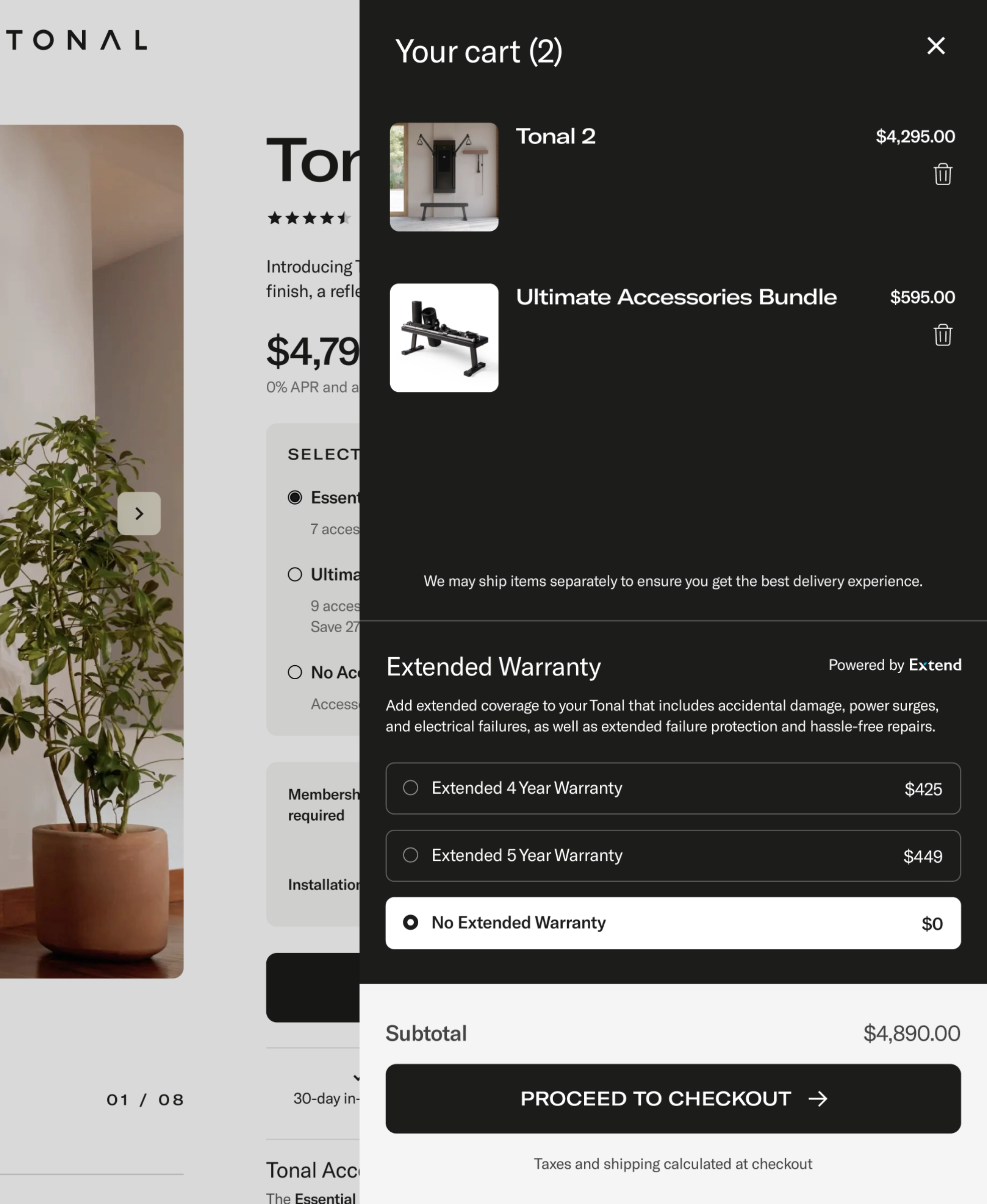
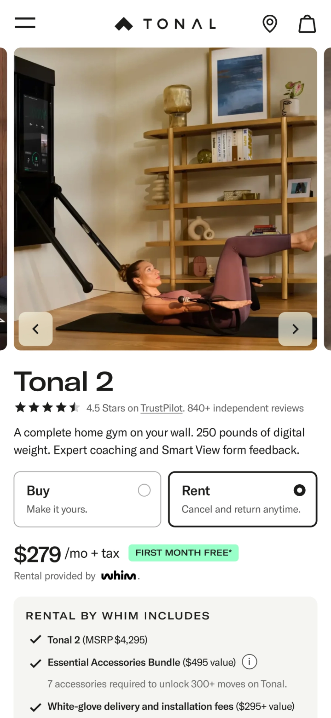
A sticky buy section, shaped with Tonal’s ecommerce team, keeps buy or rent, bundles, financing, and HSA/FSA eligibility in one place, with membership and installation spelled out above the button. Specs, reviews, and comparisons sit below for anyone who wants more.
Mobile experience
Designed for the thumb first.
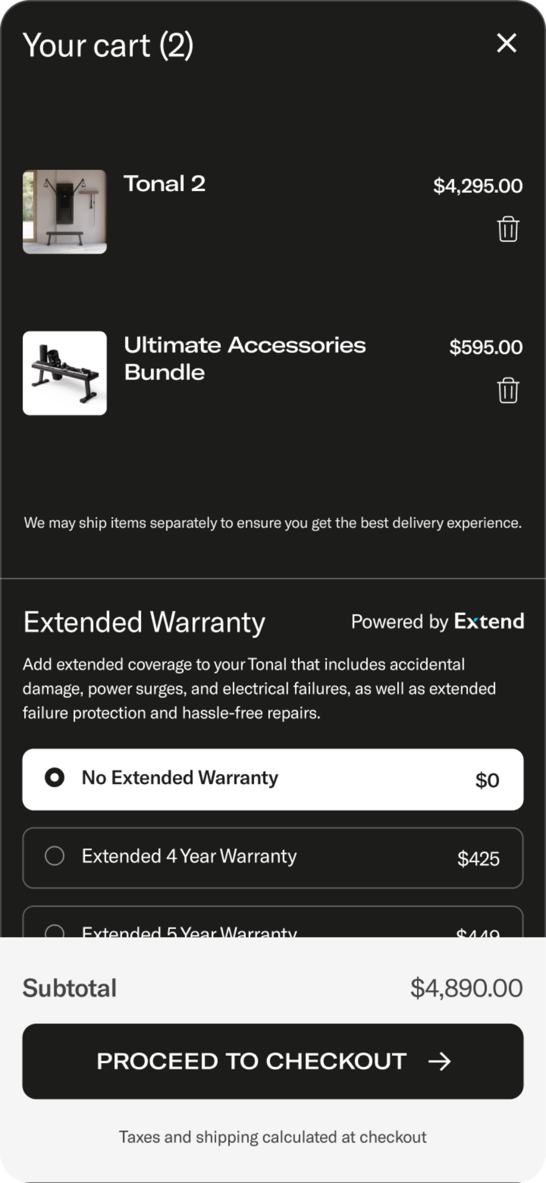
Every template was designed mobile first. On the product page, that meant getting Add to Cart above the fold on a phone without losing the membership and installation details that have to sit right above it.
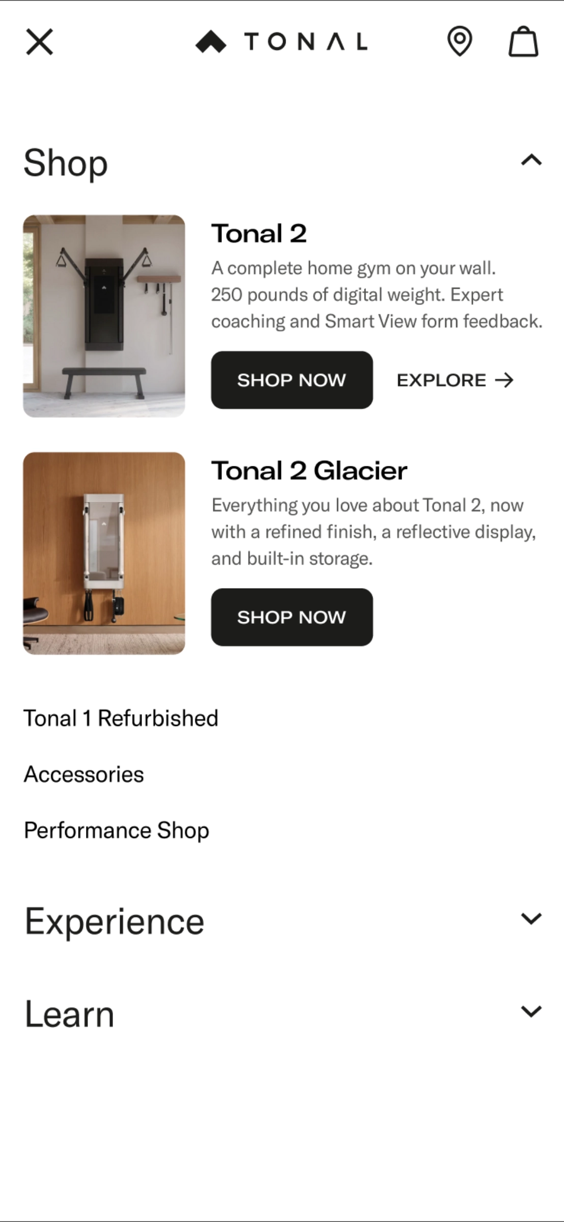
Navigation got simpler too, and the cart keeps financing and shipping details within reach on any screen.
Shopify Plus build
A foundation Tonal’s team can run with.
Behind the design is a new custom theme on Shopify Plus, built for Tonal’s team to run. The launch pages render in Liquid for speed. Marketing builds new pages from Online Store 2.0 sections and blocks in the theme editor, and every change moves through GitHub and a staging site before it ships.
We launched less than four weeks before Black Friday. The site froze for QA the week before, a rollback plan sat ready, and the first A/B test went live on launch day. Analytics events track every new template, and the product pages carry structured data that search engines and AI shopping assistants can read.
Credits
Built with Tonal’s team.
- Derek Mellencamp
- Chief Revenue Officer
- Stephen Favrot
- VP, Performance Marketing
- Angie Hill
- VP, Branding
- Doris Petersen
- Director, GTM & Revenue Program Management
- Jasmine Cousin
- Senior Manager, Ecommerce
- Antonio Sirabella
- Technical Implementation Specialist
- Jessica Kohut
- Ecommerce Associate
- Rachel Carollo
- Brand Marketing
- Ray Panarello
- Senior Copywriter
- David Cutler
- Art Direction
- 10 Days
- Campaign film and photography