Growth in assets in four years

Dirigo Federal Credit Union
Renaming a 60-year-old credit union
Credit UnionFinance
NamingBrand StrategyAccessibility TestingBrand PositioningBrand MessagingMarketing MaterialsBrand DesignLogo DesignWebsite DesignInformation ArchitectureDigital DesignWebsite DevelopmentFull Stack DevelopmentContent & Creative
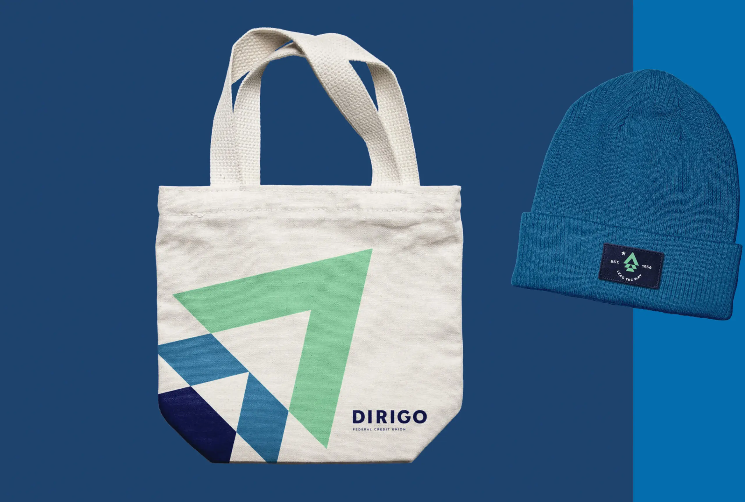
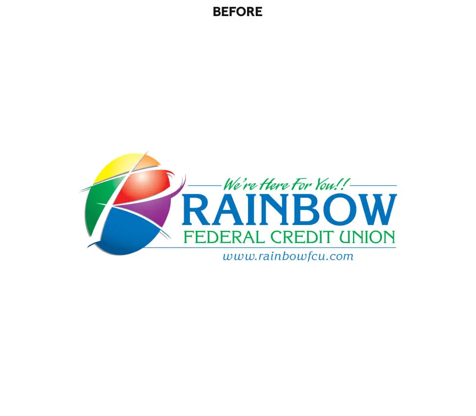
For 60 years, Rainbow Federal Credit Union served its corner of Maine. But the name had no tie to Maine or to what the credit union stood for, the look was dated, and research showed it wasn’t connecting with the people it needed to reach. So in 2017, we gave it a new name, Dirigo, along with a new strategy, brand, website, and marketing to match. In four years, assets grew 48%.
Results
Increase in monthly online membership applications
Increase in organic search traffic
Additional impressions from new digital campaigns

Rethink and restructure
Renaming a 60-year-old institution is one of the riskiest moves a credit union can make. Members have cards, checks, and habits built around the old name.
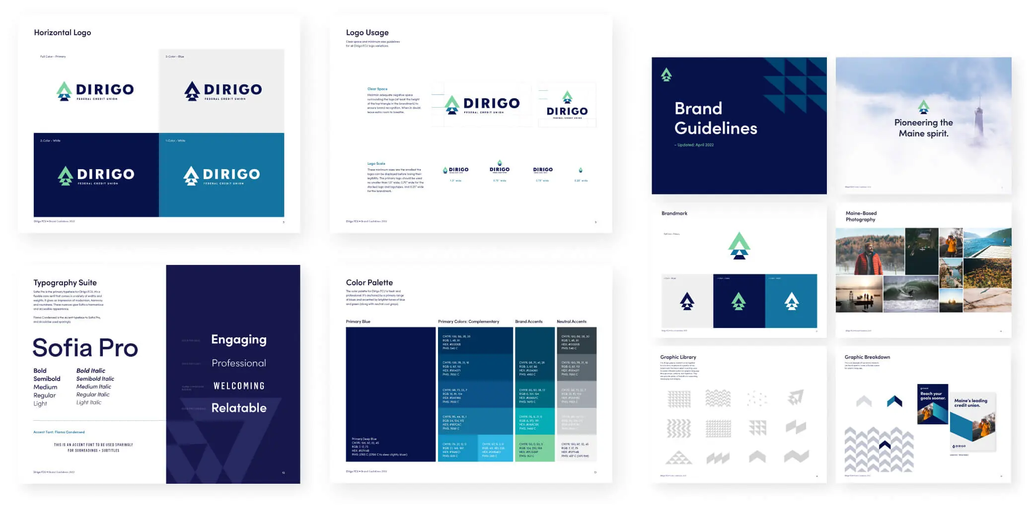
So we treated the change as a strategy problem first. We chose a name with deep Maine roots, built a confident identity and voice around it, and helped introduce it in a way that kept members on board.
Dirigo is Maine’s state motto. It means “I lead,” and it gave the credit union a name with a point of view and a brand built to grow into it.
“Thanks to Anchour, marketing is one thing we never have to worry about here at Dirigo. The rebrand and campaigns generated overnight results, and the strategic direction they provide continues to elevate our credit union. I can’t thank them enough.”
– Chief Business Officer, Dirigo FCU

Easier to find, easier to join
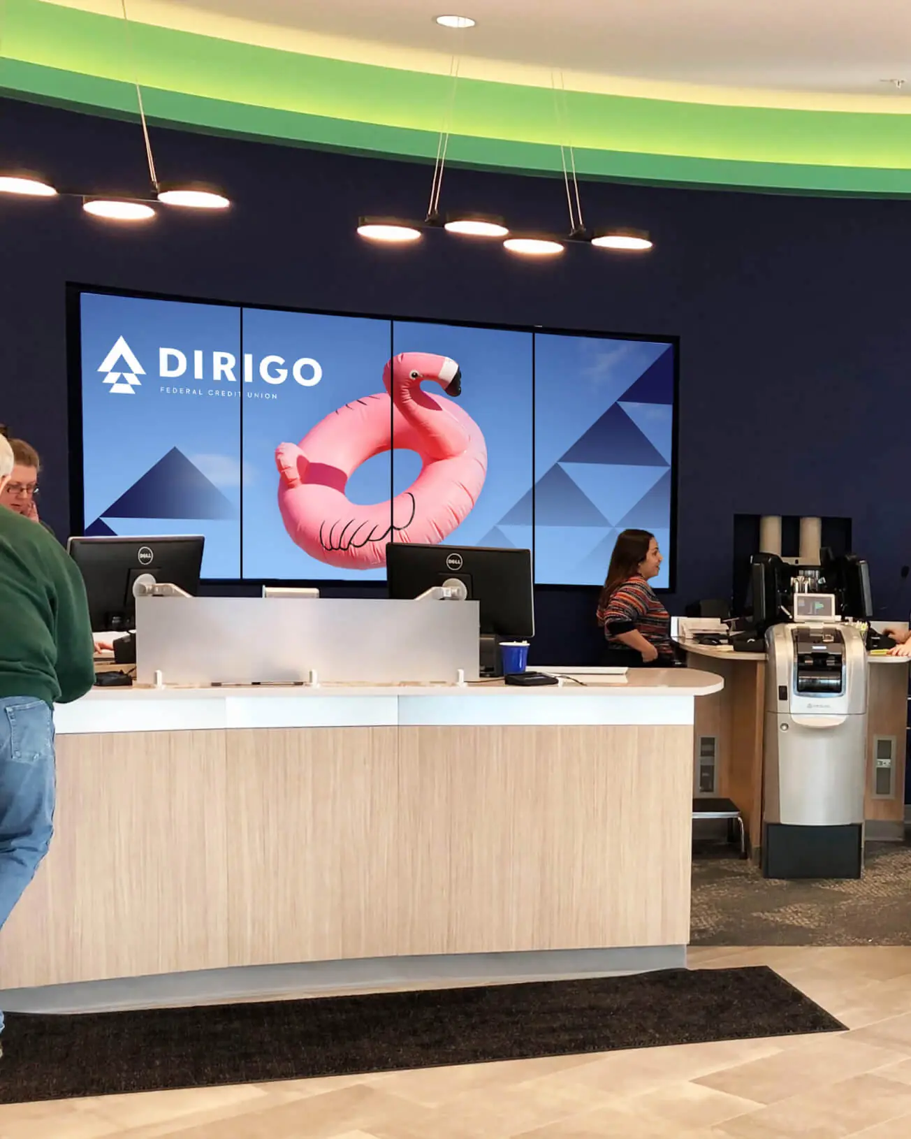
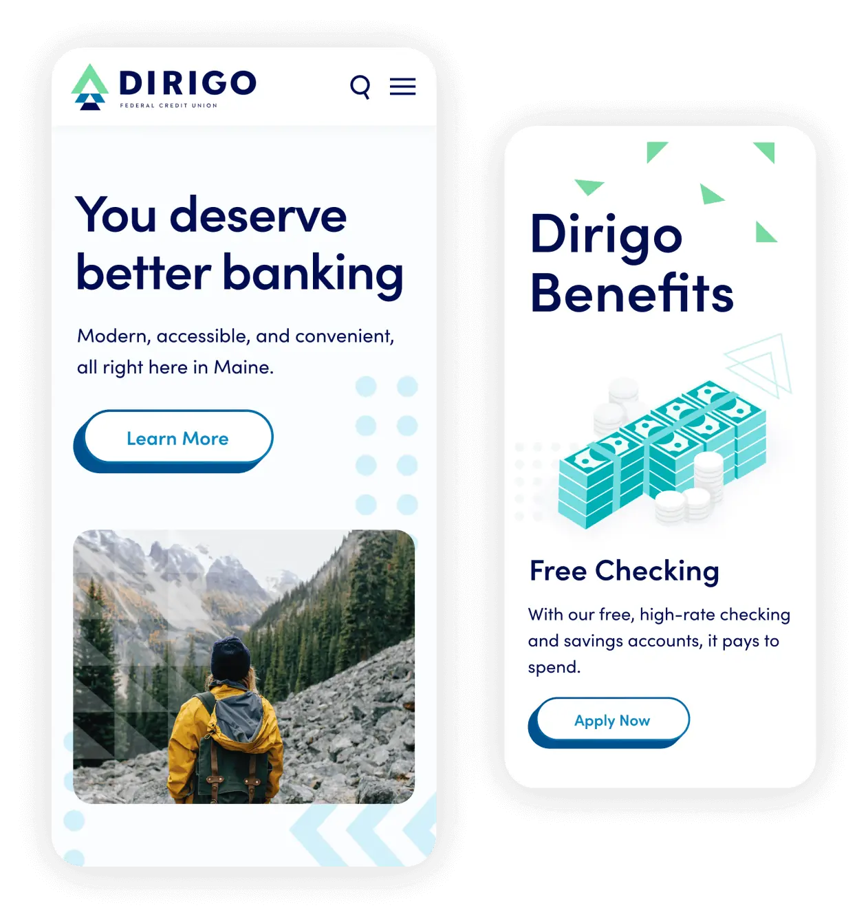
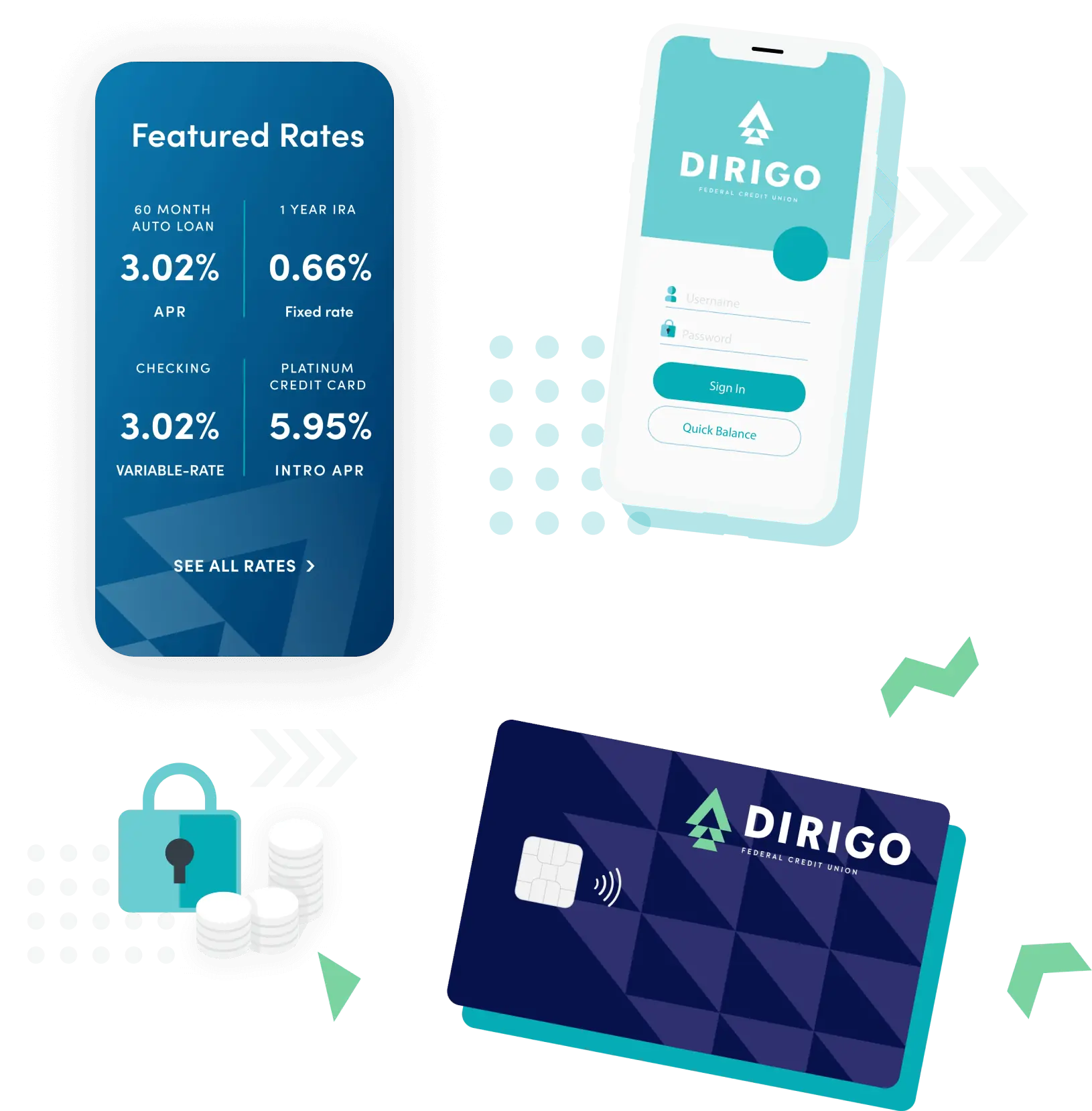
Then we rebuilt how people find and join Dirigo online. A new, accessible website made it easier to compare accounts, get help, and apply.
We also moved Dirigo’s marketing budget toward the channels that brought in new members. Organic search traffic grew 203%, and monthly online membership applications grew 3.5x.


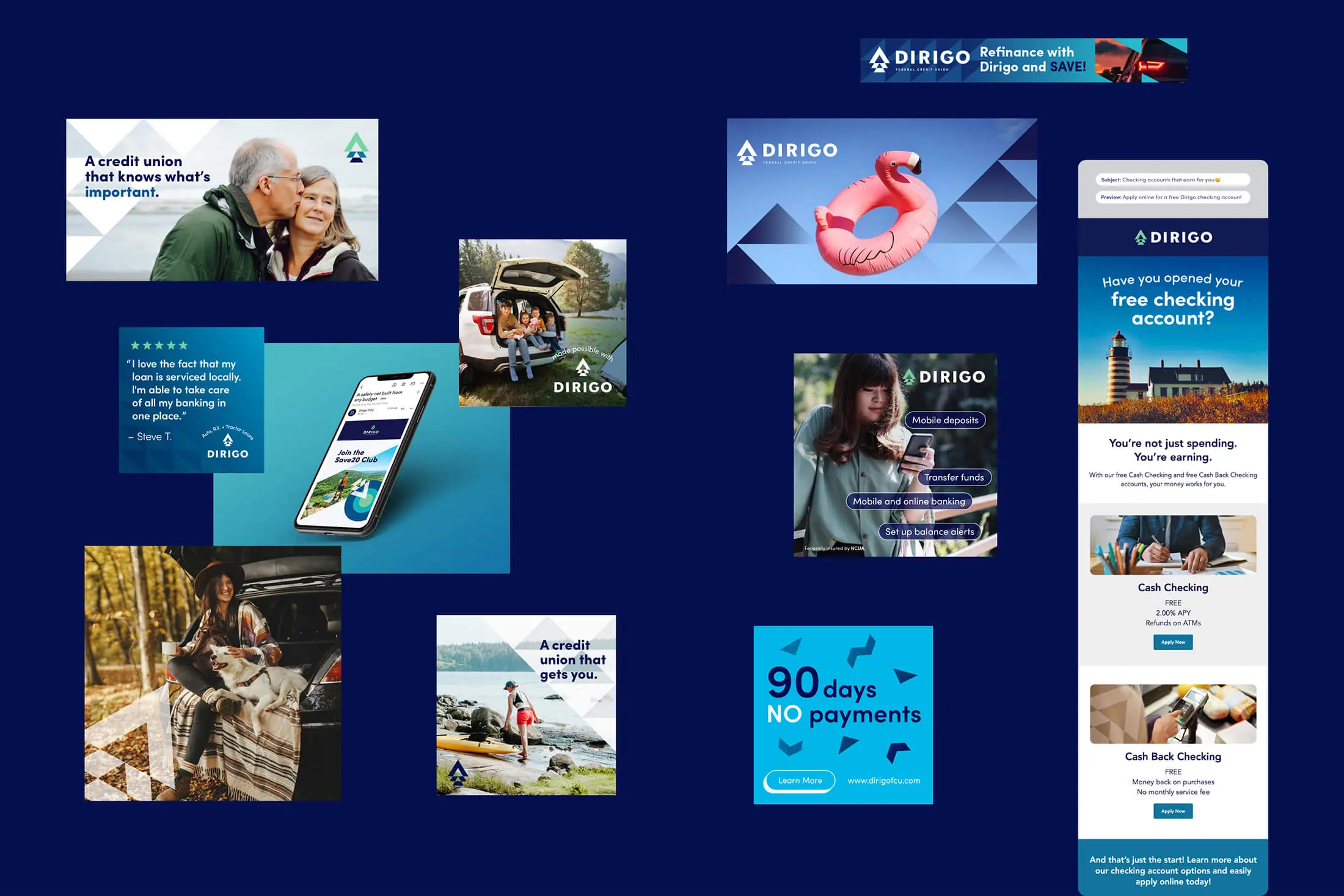
Big change = big results
The results came quickly. In four years, Dirigo’s assets grew 48%, and the credit union kept growing from there, adding a new branch in Scarborough. Today it manages nearly $500 million in assets, still under the name and brand we built as its credit union marketing agency.